In this blog post, we will continue our walkthrough of Google Analytics. This platform offers multiple methods of presenting information that can be helpful for your business.
Terms
First, let’s start with some explanations of some essential terms to know. While you analyze your dashboard, keep these metrics in mind!
Bounce Rate: This is essentially the measurement of how engaged a person is with and on your site. When a potential customer lands on your page, how quickly do they leave? A bounce rate of 90% means that users almost immediately left your site. A bounce rate of 30% implies they spent quite a bit of time on your site.
Pro tip – If your site has a high bounce rate, consider adding some more images to showcase your products or services. Images attract users to stay on the site longer!
Session: The specific amount of time that a person is doing something on your site. The key to this is “active” engagement since you want users to be performing some action on your site.
Pages/Sessions: This is one of the most functional website measurements! Pages per session indicate how many web pages a user visits while they are on your site. Depending on your site and marketing goals, a lower number of pages is usually better over more pages. (Unless it’s a blog!)
Average Session Duration: This measurement will help inform if your pages per session is a “good” number or not. Once a person engages with a page, the session duration is how long they stay on that page. This metric will vary but usually the higher the session duration the better. This is especially true for a blog or content page you want your audience to read.
Mobile Overview
Now that you know what some of the terms mean, you are ready to read your mobile overview!

This dashboard is beneficial for every single business: from what device are your customers getting to your site? For many companies, this is going to be via mobile. According to the Pew Research Center, 81% of the adult population own a smartphone – this could potentially mean more people have cell phones than they do computers. Only three-fourths of adults own a computer, for comparison.
With mobile adoption so high, at least half or more of your website traffic is likely coming from an Apple or Android device. Depending on the target audience your business speaks to, tailoring your content and marketing to be mobile optimized could be vital for your business!
For some businesses, though, the highest amount of traffic could be coming from desktop. Mobile will still be a factor because it always is, but what if the majority of your traffic is directly from a desktop computer? This means that the layout, content, imagery, and general presentation of your site are even more important for attracting and retaining customers.
Pro tip – While tablet traffic will show up on this dashboard, it is usually not a high percentage of users. If you do happen to have many tablet users, this will help you further hone in on your audience demographics!
Devices
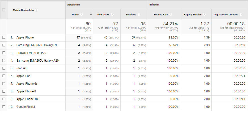
Drilling down underneath the mobile tab, Google Analytics offers even more information to help you understand your audience.

Are the majority of your site visitors iPhone enthusiasts? Or do they use Android? These are the types of questions this dashboard can answer. For many businesses, this information won’t necessarily inform about the kind of customer you have (since some people aren’t choosy about their mobile devices), but this is good information for your marketing agency or freelancer.
After reviewing your Analytics dashboard, how has this information helped you?


